Difference between revisions of "Chart DSL"
(→Bar) |
(→Line) |
||
| Line 171: | Line 171: | ||
===== Line ===== | ===== Line ===== | ||
| + | |||
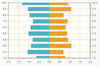
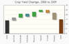
| + | Line charts connect the series of data points with lines. In the basic line charts the lines are straight. | ||
| + | |||
| + | ► '''Syntax''': | ||
| + | |||
| + | <syntaxhighlight lang="java"> | ||
| + | line [animated] [showMarker] [trendline] [cursor [zoom] [tooltip]] [fillZero] [filled] | ||
| + | </syntaxhighlight> | ||
| + | |||
| + | [[File:Charts-12.jpg|right|frame|''Line chart sample'']] | ||
| + | |||
| + | '''Notes:''' | ||
| + | *inner axis is category axis and the outer axis is data axis. | ||
| + | *'''animated''' will be set with <code>options.setAnimate(true);</code> in <code>createChart()</code>. | ||
| + | *'''showMarker''' will be set with <code>columnsSeries.addSeries(new XYseries(Yaxes.Y<scaleOrdinal>).setLabel(columnsTitlesArray.get(<measure counter>)).setShowMarker(<true if showMarker is selected>));<(code> in <code>createChart()</code> if multiple axes are defined in datamart, or <code>columnsSeries.addSeries(new XYseries().setLabel(<columnsTitlesArray string>).setShowMarker(<true if showMarker is selected>));</code> in <code>createChart()</code> if no multiple axes is defined in datamart. | ||
| + | *'''trendline''' will be set with <code>seriesDefaults.setTrendline(new Trendline().setShow( true).setLineWidth(1));</code> in <code>createChart()</code>. | ||
| + | *'''cursor''' will be set with <code>Cursor cursor = new Cursor().setShow(true).setZoom(<true if zoom is selected>).setShowTooltip(<true if tooltip is selected>);options.setCursor(cursor);</code> in <code>createChart()</code>. | ||
| + | *'''fillZero''' and '''filled''' will be set with <code>seriesDefaults.setFillToZero(<true if fillZero is selected>).setFill(<true if filled is selected>);</code> in <code>createChart()</code>. | ||
| + | |||
| + | ►'''Example''': | ||
| + | |||
| + | <syntaxhighlight lang="java"> | ||
| + | chart SalesByState described by "Sales by state and time" as line cursor zoom trendLine using datamart SalesByState { | ||
| + | axis columns renders linear | ||
| + | axis rows renders category tickangle 20 | ||
| + | legend inside toggle replot normal | ||
| + | tooltip north-east always inside | ||
| + | } | ||
| + | </syntaxhighlight> | ||
===== Pie ===== | ===== Pie ===== | ||
Revision as of 13:53, 5 August 2016
Contents
Copyright Notice
All rights are reserved by Compex Systemhaus GmbH. In particular, duplications, translations, microfilming, saving and processing in electronic systems are protected by copyright. Use of this manual is only authorized with the permission of Compex Systemhaus GmbH. Infringements of the law shall be punished in accordance with civil and penal laws. We have taken utmost care in putting together texts and images. Nevertheless, the possibility of errors cannot be completely ruled out. The Figures and information in this manual are only given as approximations unless expressly indicated as binding. Amendments to the manual due to amendments to the standard software remain reserved. Please note that the latest amendments to the manual can be accessed through our helpdesk at any time. The contractually agreed regulations of the licensing and maintenance of the standard software shall apply with regard to liability for any errors in the documentation. Guarantees, particularly guarantees of quality or durability can only be assumed for the manual insofar as its quality or durability are expressly stipulated as guaranteed. If you would like to make a suggestion, the Compex Team would be very pleased to hear from you.
(c) 2016-2026 Compex Systemhaus GmbH
Introduction
Vaadin
Vaadin is a web application framework for Java. In contrast to Javascript libraries and browser-plugin based solutions, Vaadin features a complete stack that includes a robust server-side programming model as well as client-side development tools based on GWT and HTML5.
More information: https://vaadin.com/home
jqPlot
jqPlot (http://www.jqplot.com) is a plotting and charting plugin for the jQuery Javascript framework and is dual licensed under the MIT and GPL version 2 licenses. jqPlot produces line, bar and pie charts with many features.
dCharts
dCharts is Vaadin add-on for creating charts and is a wrapper for jqPlot library.
For now dCharts support:
Bar Charts Block Charts Bubble Charts Donut Charts Line Charts Charts 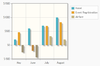
Meter Gauge Charts OHLC, HLC and
Candlestick ChartsPie Charts Pyramid Charts Waterfall Charts 
Events mouse enter mouse leave click right click
To enable it in OSBP it was neccessary to add OSGi capabilities to the addon.


Chart DSL
Chart DSL generates the vaddin dCharts ui.
The main semantic elements of the ChartDSL are:
-
package- the root element that contains all the other elements. A model can contain multiple packages. -
import declarations- used to import external models or even Java classes. -
chart- define the chart configurations, e.g. chart type, polling time, datamart details, etc. -
as bar/line/pie/donut/bubble/gauge/tree- define the type for this chart . -
using datamart- define the data source details for this chart , e.g. row/column configurations, legend details and tooltips configurations.
Syntax
Package
► Syntax:
package <package name>  {
    import <import models/class name>
     ...

    chart... [using datamart <datamart name>
    {
         ...
    }]
...
}
Chart
► Syntax:
chart <char name> [described by <discription>] as
    <chart type>
    [polling <polling time number>]
    [using datamart <datamart name> {
           ...
    }]
Generate a <chartame>+Chart.java file, in which a java class named <chartname>+Chart extended from java class AbstractHybridVaaclipseView is defined. In this class, chart and chart configurations are defined.
For the tree chart, generate explicit a <chartname>+<treetype>+JsChart.java file, a <chartname>+<treetype>+JsState.java file and a Treemap+<chartname>+<treetype>.js file.
The methods collapse(), expand(), change(), update(), click() or posistion() are defined for CollapseTree or TreeMap.
polling time sets chartRefresher.setRefreshInterval as polling time number * 1000 ms in createView(). It is only for bpm.
chart type
Define how the chart will be displayed, chart type is including
- bar,
- line,
- pie,
- donut,
- bubble,
- gauge and
- tree
► Syntax:
bar [shaded] [animated] [swapped] [stacked]
| line [animated] [showMarker] [trendline] [cursor [zoom] [tooltip]] [fillZero] [filled]
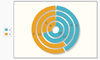
| pie [empty]
| donut
| bubble [multiplier <value number>] [gradient | transparent]
| gauge [label <label value>] [hasTicks minimum <minValue number> maximum <maxValue number>][ intervals { up to <signed interval value> segmentcolor <rgb string>}]
| tree map|collapsible
Bar
Bar charts illustrate values as vertical or horizontal bars, respectively. Multiple data series, that is, two-dimensional data, are shown with thinner bars or columns grouped by their category.
► Syntax:
bar [shaded] [animated] [swapped] [stacked]

Notes:
- Inner axis is category axis and the outer axis is data axis.
- shaded will be set with
seriesDefaults.setShadow(true).setShadowAlpha(0.05f);increateChart(). - animated will be set with
options.setAnimate(true);increateChart(). - swapped will be axisSwith which means YX instead of XY as axisPrefix..
- stacked will be set with
options.setStackSeries(true);increateChart().
►Example:
chart SalesPerRegion described by "Sales per state/province" as bar shaded stacked swapped using datamart SalesByDistrict {
    axis rows renders category
    axis columns renders linear tickangle 25
    legend inside toggle replot slow
    tooltip east always inside
}
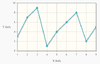
Line
Line charts connect the series of data points with lines. In the basic line charts the lines are straight.
► Syntax:
line [animated] [showMarker] [trendline] [cursor [zoom] [tooltip]] [fillZero] [filled]

Notes:
- inner axis is category axis and the outer axis is data axis.
- animated will be set with
options.setAnimate(true);increateChart(). - showMarker will be set with
columnsSeries.addSeries(new XYseries(Yaxes.Y<scaleOrdinal>).setLabel(columnsTitlesArray.get(<measure counter>)).setShowMarker(<true if showMarker is selected>));<(code> in <code>createChart()if multiple axes are defined in datamart, orcolumnsSeries.addSeries(new XYseries().setLabel(<columnsTitlesArray string>).setShowMarker(<true if showMarker is selected>));increateChart()if no multiple axes is defined in datamart. - trendline will be set with
seriesDefaults.setTrendline(new Trendline().setShow( true).setLineWidth(1));increateChart(). - cursor will be set with
Cursor cursor = new Cursor().setShow(true).setZoom(<true if zoom is selected>).setShowTooltip(<true if tooltip is selected>);options.setCursor(cursor);increateChart(). - fillZero and filled will be set with
seriesDefaults.setFillToZero(<true if fillZero is selected>).setFill(<true if filled is selected>);increateChart().
►Example:
chart SalesByState described by "Sales by state and time" as line cursor zoom trendLine using datamart SalesByState {
    axis columns renders linear
    axis rows renders category tickangle 20
    legend inside toggle replot normal
    tooltip north-east always inside
}