UI DSL
Contents
Purpose
The UI DSL facilitates the creation of model-based user interfaces (UIs) and their integration into complex applications. It is not intended for styling and design specifications.
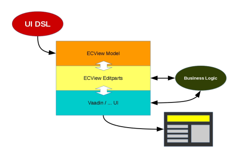
Using UI DSL, layouts and fields can easily be defined along with the appropriate validation and binding mechanisms. The underlying ECView model uses Eclipse databinding to create an efficient databinding between UI elements and the Java objects they represent. The UI model is kept independent of rendering implementations so that it can be easily re-used.
By referencing DTO models (as defined by the DTO DSL) in the UI DSL, UI model and internal application logic can be tightly interwoven. The ECView UI model is extensible and allows for a straightforward implementation of new UI elements.
The UI DSL is used to define UI models along with the desired validators and databindings. Valid UI DSL files are compiled to ECView model definitions (Java classes) that are interpreted by the UI renderer in real time. Thus, the UI DSL acts as a simplified frontend for the ECView model.
In the reference implementation, Vaadin has been chosen as the UI framework that is used to render the UI model. However, since the model-view-controller distinction has been observed, it is possible to change the rendering service without having to change the underlying UI model. For example, JavaFX might be used to render the exact same UI model as Vaadin.
ECView is a UI model based on the Eclipse Modeling Framework (EMF). It defines various UI elements and their properties and possible relations. UI elements are thus represented as EObjects and can be manipulated accordingly. Furthermore, databinding can be done efficiently by using the Eclipse databinding mechanism. ECView attaches so-called editparts to its model elements. Acting as controllers, these editparts tie the application's model and its visual representation together. Editparts are responsible for making changes to the model. ECView provides support for various validation mechanisms (min-length, max-length, regex ...). The UI DSL can make use of such validations easily and allows the definition of additional custom validators using Xexpressions. Application logic can interface with the UI model using the editparts of the respective model elements (reading values, changing visibility etc.). Furthermore, the rendered UI may be addressed by application logic directly, if necessary.
UI Model Files
UIs are defined in text files with the file extension .ui. These UI model files carry the information necessary to render a user interface and are made up of the following sections:
- Package declaration: The UI model file must have a unique fully qualified name that can be specified with the package keyword at the beginning of the file.
- Import section: UI model files can address definitions from other models (e.g. datasource or validator specifications). The model files that contain these definitions can be specified with the import keyword followed by the fully qualified name of the file and the
*wildcard. - Validator definitions: The UI DSL supports the usage of validators that can be attached to UI elements directly in the UI model file. If validators are to be used for several UI elements, they may be defined once in this section and given an alias that can then be used to attach them to other UI elements. A validator can be defined for later use by the
validatorAliaskeyword. - The UI model definitions: The UI is described as a tree-like containment structure, starting with the root element. This can either be an
ideview(for a desktop view) or amobile(for a view optimized for smartphones).
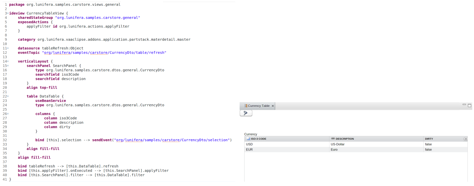
There are two Eclipse views that can be used for UI preview: A "Vaadin IDE Preview" view that displays a "desktop" UI and a "Vaadin Mobile Preview" view that renders a mobile UI. Both views are generated from the current .ui model file.
Syntax
The UI model DSL uses keywords to define UI elements. The UI elements represent a containment tree starting with either an ideview or a mobile view as topmost element. In order to reflect the containment structure, keywords for UI elements may be followed by braces that surround the keywords for contained elements.
Package Definition
With package keyword, the user defines the UI package that contains views.
► Example:
package <UImodel name>  {
    <views>
}
Views
A view is the topmost UI element and can contain further UI elements. Currently two type of views are supported: ideview for desktop, and mobile view for mobile devices.
ideview
This keyword defines a desktop view. It is used as a root element for rendering the UI. An ideview may be given a name; it can contain the following elements:
-
sharedStateGroupdefinition (optional): Views may belong to one shared state group if anISharedStateContextis provided by theViewContext. Shared state groups are used byIBeanSearchServiceto provide and handle a consistent set of data shared across multiple views. This comes with a shared "dirty" state for changed data that have not yet been written to the database. Shared state groups are identified by a String. -
categorydefinition (optional): Views may be assigned to categories that are handled by external frameworks. This setting has no effect within the UI DSL, but can be used to pass information to an external framework. -
exposedActions(optional): actions that are defined within the view, but can be executed from without (e.g. load, save, delete etc.). -
datasourceand data alias definitions (optional). - UI elements: These elements make up the visible content of the view. They may be hierarchically nested.
- "global" validation assignments (optional).
-
databindingassignments (optional). - visibility processor directives (optional).
mobile
This keyword defines a view optimized for mobile devices such as smartphones or tablets. This "mobile" view serves as topmost UI element and can contain further UI elements. In addition to the elements supported by ideview, mobile views also control transitions between pages.
UI Elements
The following sections describe the keywords that define basic UI elements. Most of them can be used in both ideview and mobile contexts.
Layouts
horizontalLayout
A horizontal layout can be generated with the horizontalLayout keyword and can optionally be given a name, an i18n key, a string with CSS styles and a readonly flag. In a horizontal layout, elements are arranged next to each other with labels above the element.
Autowiring information, databinding instructions and visibility processor directives may be defined separately for each layout. After the closing braces, an alignment may be specified.
Syntax:
horizontalLayout [i18n <i18nKey>] [styles <stylesString>] [readonly] layoutname {
    [autowire source <autowireSource>]
    <UI elements>
    [bind <binding>]
    [visibility <directive>]
} [align <alignment>]
Example:
package net.osbee.sample.pos.uimodels

ideview Location {
    horizontalLayout person {
        textfield Name
        textfield City
        textfield State
    }
}
The above example will arrange three text fields next to each other.
verticalLayout
A vertical layout can be generated with the verticalLayout
keyword and can optionally be given a name, an i18n key, a string with
CSS styles and a readonly flag. In a vertical layout, elements are arranged
above each other with labels above the element.
Databinding instructions and visibility processor directives may be defined separately for each layout. After the closing braces, an alignment may be specified.
Syntax:
verticalLayout [i18n <i18nKey>] [styles <stylesString>] [readonly] <layoutname> {
    [autowire source <autowireSource>]
    <UI elements>
    [bind <binding>]
    [visibility <directive>]
} [align <alignment>]
Example:
package net.osbee.sample.pos.uimodels

ideview Address {
    verticalLayout person {
        textfield Name
        textfield Street
        decimalField Number
    }
}
The above example will arrange three text fields stacking above each other.
gridlayout
A gridlayout can be generated with the gridlayout keyword and can optionally be given a name, an i18n key, a string with CSS styles and a readonly flag. In a gridlayout, elements are arranged in columns, the rows being filled from left to right. Element labels are displayed above the element. In parentheses after the keyword, the desired number of columns may be specified (default is 2), and an i18n key, a string with CSS styles and a readonly flag may be given.
Databinding instructions and visibility processor directives may be defined separately for each layout. After the closing braces, an alignment may be specified.
Syntax:
gridlayout [columns=<columnNumber>] [i18n <i18nKey>] [styles <stylesString>] [readonly] <layoutname> {
    <UI elements>
    [bind <binding>]
    [visibility <directive>]
} [align <alignment>]
Example:
package net.osbee.sample.pos.uimodels

ideview Target {
    gridlayout (columns=2) {
        textfield Name
        textfield Street
        decimalField number
    }
}
In the above example, a gridlayout arranges its elements in rows and columns. The rows are filled from letf to right, then the columns from top to bottom.
form
A form layout can be generated with the form keyword and can optionally be given a name, an i18n key, a string with CSS styles and a readonly flag. In a form layout, elements are arranged in a column. Element labels are displayed on the left side of the element.
Databinding instructions and visibility processor directives may be defined separately for each layout. After the closing braces, an alignment may be specified.
Note: A form layout disables alignment specifications for the elements contained in it.
Syntax:
form [i18n <i18nKey>] [styles <stylesString>] [readonly] <layoutname> {
    <UI elements>
    [bind <binding>]
    [visibility <directive>]
} [align <alignment>]
Example:
ideview Target {
    from AdressForm {
        textfield Name
        textfield Street
        decimalField number
    }
}
In the above example, the form layout will lists the contained elements below each other, and set the labels to the left of the elements.
Tabs and Tabsheets
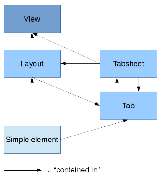
Tabs are similar to layouts insofar as they can contain other layouts. Tabs themselves have to be contained inside a tabsheet, however. The tabsheet in its turn can reside inside a layout or be directly attached to a view. Similarly to layouts, tabsheets can be nested (a tab can contain an "inner" tabsheet). Below shows an illustration of these containment possibilities:
tabsheet
A tabsheet is created by using the tabsheet keyword (optionally followed by an i18n key and/or a string with CSS styles) and can be given a name. The tabs contained in the tabsheet are described within the braces following the tabsheet statement: Each tab is introduced with the tab keyword followed by a name and the tab contents: either a single UI element or a layout with several UI elements.
Syntax:
tabsheet [i18n <i18nKey>] [styles <stylesString>] [<name>] {
    [tab <name> <tabContent>]
    [bind <binding>]
    [visibility <directive>]
} [align <alignment>]
tab
A tab may carry a single UI element, a layout or a tabsheet. Tabs must reside in tabsheets. After the tab keyword, a tab may be given a name, followed directly by the tab content.
Syntax:
tab <name> <tabContent>
Sample:
package net.osbee.sample.pos.uimodels

ideview Location {
    tab one form CurrentLocation {
        textfield Name
        textfield Street
        numericField Number
    }
    tab two textarea Overview
}
In the above example, a tabsheet holds tabs that can contain either single UI elements or layouts.
Dialogs
Dialogs are a special case of layouts: They open in new "views" that are laid over the ordinary UI; much like pop-up windows. Dialogs are a dynamic feature of the UI and are opened with commands, see section "Commands" below for commands that can be used.
dialog
A dialog is created by using the dialog keyword (optionally followed by an i18n key and/or a string with CSS styles) and can be given a name. A dialog may be given a type, and it can contain UI elements.
Databinding instructions and visibility processor directives may be defined separately for each layout.
Syntax:
dialog [i18n <i18nKey>] [styles <stylesString>] [name] {
    [type <type>]
    [<UI elements>]
    [bind <binding>]
    [visibility <directive>]
}
searchdialog
A search dialog is similar to a regular dialog. It is created with the searchdialog keyword. The difference is that in a search dialog, search fields may be specified. The search dialog provides wildcard support for the search fields, see section "searching" below for details.
Syntax:
searchdialog [i18n <i18nKey>] [styles <stylesString>] [name] {
    [type <type]
    [search { <searchfields> }]
    [content { <UI elements> }]
    [bind <binding>]
    [visibility <directive>]
}


